Friday, May 4, 2007

In The Future...

Storytelling and interactivity: Your vision for the future of media. 100 years is too far away. What will we be interacting with in seven years?

The future will mean more control for the way comic book collectors and fantasy sports owners access and interact with their chosen hobbies.

Comic Books or Graphic Novels

online comic printCollectors and enthusiasts in the year 2014 will have fully embraced the ever-evolving digital revolution by following the monthly adventures of Spider-Man, Batman and Harvey Pekar in a strictly online format.

Readers would stop buying books in a comic store and instead visit a supplier operating an online store hawking new comic books at cover price and discounted back issues. The reader would then download a digital file and save millions of tree acres each year. Perfect.

Readers can also visit specific comic publishers and download their books in a digital format. Navigational features would be added that would allow the panels to individually expand and fill the screen before retreating back into story with a single click.

The future would also bring a chance for the reader to serve as the artist. So you didn't like the story you just read? You hated the way Spider-Man removed his mask in front of a billion people on television? Then you could alter the events with a few mouse clicks.

Daring artists and publishers would also include free access to bonus files filled with character and background artwork for the reader to alter and recreate the story. The reader can be creative while understanding the artist's intentions with the story. The idea loosely follows the idea of "mash up".

Fantasy Sports

An estimated 20 million people maintain their own version of a professional sports "dream team" by participating in a fantasy sports league. Fantasy owners will spend hours research playing stats and trends in order to draft the players and maintain the best roster possible.

The Canadian-based LiveHive Systems scored some headlines in January when it unveiled its NanoGaming baseball program at Fantasy Sports Trade Association's annual business conference. The company proclaimed its new service the future of fantasy sports. The program would allow people watching games to predict if the batter will get a hit, walk or strike out while competing against friends and strangers alike.

That is all good for right now, but the year 2014 will usher in a new era of control as owners will be able to watch and manage their team through detailed real-time statistics on their portable hand-held television device or computer.

baseball live scoreSo say you have Roy Halladay, Derek Jeter and Jason Varitek on the same team. Well, you can see them all together wearing the uniforms you have designed through an interactive Web program. Your “dream team” would then play in a virtual baseball game you manage (setting the batting lineup and removing pitchers for starters.)
Bonus: Robots

I would be amiss if I didn't mention how cool it would be if the robotic era grew in prominence. I could see robots moving through the kitchen preparing meals from recipes downloaded from the World Wide Web. But how cool would it be to have your personal robot---one that transforms from a vehicle into a walking machine?

Friday, April 20, 2007

Assignment: Interaction Design

Any trip to Toronto, Ontario, Canada, should include a visit to the 57,000-square-foot Hockey Hall of Fame. And the Hall of Fame will satisfy all of the conditions my mother and 15-year-old son have placed on our afternoon outing.

The home page is places the Hall of Fame information on the right side of the page and offers general links such as general information and exhibits tour. Below the main links are two sub-sections of great interest: Information and Hall Highlights.

I have a feeling this outing will turn out well. Well, at least during the planning stage.

Anyway, I click the general information button and I am taken to a new page offering navigation above a graphic of the Stanley Cup. It takes me a few moments to orientate myself and the navigation scheme. The general links lie on the right side while topics that range from "Plan Your Visit" to "Visitor Information" rest on top.

The "Plan Your Visit" page offers six sections anchored by an icon and a descriptive paragraph eliminating any worry of mystery meat navigation.

Parking and Traffic

Numerous transportation options exist from riding the city subway or navigating through the city’s famed underground mall. The site offers [in detail] two lots that will relive any stress my mother will feel about parking.

Accessibility

The Web site offers its information in a basic and concise format. I learn wheelchairs can reach every area of the Hall of Fame. Perfect. An elevator is also available. Excellent. There is one chair for guests. Yikes. I will need to reserve a chair in advance by calling 416-360-7735 ext. 231.

Cool Exhibits

The Hall of Fame prides itself on offering a myriad of interesting and interactive exhibits. Josh can entertain himself by [and not limited to]:

Dining

The site includes a page devoted to the The Bottom Line Sports Bar and Grill, a 40-step walk from the Hall of Fame. The restaurant, operated by a former NHL hockey player, offers the typical menu of soups and salads, pizza, surf and turf, burgers and sandwiches. The Hall of Fame Web site also includes a 10 percent discount.

Tour Guides

This is a self-guided tour. My search for any guide information proved unsuccessful.

Visiting Length/Special Events

The Web site states the average visit to the Hall of Fame is three hours, but the good news is the admission is good for the entire day. If the family is bored with some of the exhibits, then shopping in the BCE Place (the mall that houses the Hall of Fame) could be in order.

As for any noteworthy events, I had to type "special events" into the search box, only to discover that the Hall of Fame News page might be my best bet. I found no information, but a free subscription to the Hall of Fame's electronic newsletter could be useful for future planning.

The End

With the Hockey Hall of Fame Web site, I quickly discovered the pages I wanted to see without much fuss. And the ease of the navigation design allowed me to explore the site and discover some exhibits that I wanted to see during my recently concluded trip to Toronto.

The professional look and feel of the site coupled with its expert use of interaction design makes this my choice as a strong example of interaction design.

Interaction Design: Ugh!

"The Largest Barbed Wire Historic Museum in the World."

This is the claim to fame for the curators of the Devil's Rope Museum in McLean, Texas.

But it would seem the museum would greatly benefit from a better designed Web site --- from an information architecture point of view.

For starters, the top navigation bar housing the links are not grouped in a clear and logical format. I mean does my mother need to know all sorts of information on the artist Al Napoletano? What is the connection of Route 66 to the barbed wire museum?

The site is based on a one-column design with numerous rows requiring constant scrolling in order to locate information. If the visitor is impatient then he or she may not find a second navigation box at the bottom containing even more links.

The museum's interactive design doesn't allow me to find any accessibility information for my grandmother and the Web site fails to offer any detailed information on parking and restaurant options.

The Web site's style is also as inconsistent as the information architecture. The Web developer has adopted a folksy language (“Howdy There Pardner”) that may confuse foreign visitors or those not familiar with Texas slang. The term “Web site” is written in two different ways and some phrases including “BEST LITTLE WEBSITE IN TEXAS” are capitalized.

My trust in this Web site is on life support.

Let's Meet Tatum Bell

bell photoTatum Bell, 35, lives in a loft in Minneapolis' historic Loop Warehouse District, with his wife of four years, Stephanie. Their neighborhood is a funky bohemian mix of artists and energetic young couples like the Bells who always flock to catch the newest Richard Linklater film at the Uptown Theater or share a microbrew at a Lake Street bar.

Tatum is action-oriented and his thirst for activity is only strengthened by his personal, albeit cliched mantra: "I work to live, not live to work."

He spars in his Tae Kwon Do dojang three times a week and plays defense for the local ice hockey team at the community center. Tatum does place high importance on quality work as the associate director of research testing for St. Jude Medical---a position he has held for four years. His pager and cell phone are on 24 hours a day. He works on weekends without hesitation as he feels, in part, to justify his $125,000 salary.

But he is proud of his balance between work and recreation.

Recreation Balance

In fact, the Bells, who have no children, will embark on their first trip of the new year in April to visit New Zealand to experience the country that produced their favorite film, "The Lord of the Rings: The Two Towers." Their fall trip will be to see a Toronto Blue Jays baseball game at Toronto’s Rogers Centre, the last of the couple's 30-stadium tour.

Tatum Bell has placed a particular importance on education since his parents came from a strong learning background (his mother is an elementary school principle in Duluth and his father, now retired, was a microbiology professor at the University of Minnesota—Twin Cities).

Tatum received his undergraduate and master degrees from the Univ. of Minnesota and earned his doctorate in biology from the rival University of Wisconsin, where he met Stephanie seven years ago.

Tatum still supports the maroon and gold of his alma mater through yearly dues to the alumni association and by helping students secure internships and jobs at St. Jude Medical.

As a moderate Republican, Tatum Bell is excited by the prospect of his city hosting the 2008 Republican Convention at the Xcel Energy Center. He attends Roman Catholic church services twice a month and he is active in the local soup kitchen serving meals and discussing with patrons about the Minnesota Twins chances to resign pitcher Johan Santana to a long-term contract.

Media Consumption

Tatum does find time to use various media products, such as reading Sports Illustrated, Minnesota City Pages and U.S. News and World Report. He has high-speed Internet access, but he limits his time online to about one hour a day to download music for his iPod, sharing photos with some Phi Gamma Delta fraternity brothers living North Carolina.

He also keeps track of his fantasy baseball team (currently mired in last place in the ESPN league). Any more time spent on the computer would impact Tatum's plans to fully experience life.

Tatum has a strong loyalty to activities he finds pleasing. He has cheered for the Minnesota Twins for 27 years and he is about three years away from securing season tickets for football's Minnesota Vikings. And he earned his third-degree black belt late 2006 marking a milestone in his 18-year martial arts career.

Desired Demographic

The Twin City News wants to attract new readers like Tatum Bell because he is an advertisers dream. Why? He is flushed with loads of disposable income. He is affluent. He is highly-educated. He is active.

Please Welcome Gina Park

imageIf Gina Park, 19, had a personal mantra, then this anonymous quote would be it:

"If I ever die of a heart attack, I hope it will be from playing my stereo too loud."

Ever since discovering a copy of Soul Asylum's 1986 album, Made to be Broken from her 27-year-old brother Daniel, Gina feeds her passion for music at every opportunity.

Gina's love of all things musical started back in elementary school and was strengthened through her years in middle school in the St. Paul school system and culminated with a drum major position at her alma mater, Rosemount High School. Music education is part of the curriculum at Minnesota public schools. A few rock concerts later (R.E.M., Husker Du and Wilco) with Daniel and Gina was hooked.

Gina spends most of her disposable income on music publications (NME from England and Paste Magazine in the United States) and on record albums and pricey compact discs from independent stores such as Treehouse Records and the Electric Fetus.

Parental Control

Gina's music spending on music does worry her parents a bit. Jung and Marie Park are two Seoul, South Korea immigrants who moved to Minneapolis 20 years ago and preach the tenants of saving money over spending indulgences. Gina does work 30 hours a week as server at the Dunn Bros Coffee near her school, St. Paul Community College to help pay for studies and save money. The college is a 20-minute drive from her parent's two-story suburban home in the St.Paul area (zip code 55129) in a neighborhood full of school teachers, office employees and the like.

Gina sports a nifty 3.75 GPA and she is completing her general studies at the community college in order to pursue a recording technology degree at McNally Smith College of Music. Gina has no interest in playing music; she wants to guide it as a record producer/engineer. She plans on living in the dorms once she transfers to the college.

Free Time

If Gina has any free time to herself, she usually spends it listening to indie rock shows at the famed First Avenue and the 7th Street Entry and occasionally sees larger bands like Green Day at the 20,000-seat Xcel Energy Center.

Gina searches for new bands and communicates her friends over the social networking site Myspace.com and Ruckus, a college-only multimedia service. She will spend no more than $15 a week downloading music onto her 30GB iPod. Technologically savvy, Gina posts daily to her Web blog daily and designs Web sites for local bands.

She communicates via instant messenger with friends she met at a Boston hostel while on vacation with friends last year. She grows impatient with slow connections and error messages.

Gina is Roman Catholic and attends mass occasionally, but she identifies herself as spiritual rather than religious. Religion plays a larger role with Daniel, a youth pastor and marketing executive with the St. Paul Saints minor league baseball team.

Gina is affable and her clothing reflects her mood. She shops at second-hand stores looking for bargains and she is often happy wearing Dr. Martens shoes, jeans, skirts and T-shirts. She will wear dresses and long-sleeve sweaters for more formal occasions and also to hide the chain tattoo design on her left arm from her parents.

Newspaper Habits

Gina will occasionally glance through a newspaper as she cleans tables in the coffeehouse shop. She will stop long enough to scan the major headlines before tossing the contents into the recycling bin. She also follows the news through a scrolling headline box on AOL Instant Messenger and watches a few minutes of CNN nightly with her parents.

Gina's favorite Web sites stored on her Mozilla Firefox browser include links to popular music sites where she can listen to free MP3 files on sites including Pitchfork.com and Stylus Magazine.

Gina Park is important to the Twin City News because she offers brand loyalty with regards to the Web sites and products that offer the content she covets.

If the newspaper expands its online entertainment offerings to include more arts and entertainment online-specific content such as an MP3 music listening station, exclusive interviews and videos, then she would be more interested in exploring and perhaps building a lengthy relationship with the paper’s Web site. Newspapers are losing young readers and attracting readers like Gina would be a good first step.

Thursday, April 19, 2007

Mowser---From the Screen to Your Cellphone

As a web editor, I am constantly trying to learn new scripting languages to present information in a cleaner and more interesting fashion on all browsers and viewing platforms. And that includes creating content for mobile phones of all varieties from tiny monochrome screens to the current high-resolution models.

And that means thinking about how the pages will look on a tiny screen.

Anyway, I read about a web-based application that reconfigures Web pages for a mobile phone. Mowser is a program that translates pages for mobile phones through complex algorithms and alters images, text formatting and page functionality (at times).

From my experience and those of my co-workers, for a tiny, monochrome screen, I think Mowser is great tool. It offers the important items on the first page in a cohesive order and all the menus floated to the bottom. People using a mobile phone to surf the Web cannot really expect much more, can they?

Friday, April 13, 2007

Olive is Not Drab. No Really.

My organization’s graphic designer loaned me his copy of a wonderful reference book from Neenah Paper based on the Dewey Color System, dubbed the "world's first color validated color test."

Olive is Not Drab allows readers to pick the right color combinations to communicate "specific brand attributes" through ready-made color palettes that explain what those colors truly communicate about the brand and the company.

So, let's say your company wants to convey a message of high-energy (which the book said evokes an "attention-getting immediacy") then a color palette of indigo, red, gold and black would be in order. Wait, so you want to show the world that your brand/company offers a reserved point of view (known as composed)? Blue and red-orange would be your best bet.

I also love the authors’ quick color breakdown. Here is a sampling of the commentary:

  • Purple communicates out-of-the-box thinking. It appeals to the "impulsive, reactive and emotional consumers."

  • Red-orange is establishes a homelike, familiar feeling while signifying the "expression of composed and objective opinions."

  • Green indicates social and cultural diversity. Paired with yellow, green can help create "worry-free market acceptance of products and services."
So where does gut instinct and personal aesthetic fit in?

Friday, March 23, 2007

Week 10: Activity-Centered Design

I will be traveling to Toronto in April for four days so I want to find a hip jazz club in the city with a $10 cover charge. I decided to visit a local paper, The Toronto Star, and search for some of the larger, more established clubs.

Initial Battle Plan

  • Visit the newspaper’s home page at www.thestar.com.Click on the entertainment link.
  • Look for club listings on the calendar.
  • Pick one and evaluate the cover/ticket charge.
  • Log-off and start packing.

Reality Check:

  1. Searched for Toronto Star on the clusty.com search engine
  2. Clicked on the "Arts and Entertainment" tab on the navigation bar.
  3. Found two choices: Music or "Buzz"
  4. On the “Buzz” homepage, I scrolled through the stories that ranged from the "Naughty Sounds of Ms. Sorbara" and "Pop Goes the Week" to find any side navigation to music club listings.
  5. Score! Found the article, "All This Jazz" with the sub headline: "In four days, Toronto's jazz fortunes are set to rise with the debut of a swank downtown club, a partnership between a jazz impresario and one of the city's entertainment magnates."
  6. Skimmed through the article. The reporter rates the sound system and kitchen as outstanding and the $58,000 piano earns high marks from musicians. A paragraph mentions the usual weekday cover charge is $10.
  7. And proving that serendipity is on my side, I spot a sidebar to the left of the article showcasing five jazz clubs in the city. The reporter only analyzed the price of one club, the expensive Opal Jazz Lounge (between $10 and $19 for an appetizer.) The Rex Hotel Jazz & Blues Bar and Lula Lounge sound promising.
  8. I log off.

Conclusion

The navigation bar was relatively easy to find and the labels were mostly clear, but I relied on serendipity to find my jazz listings.

I returned to the “Buzz” page to search for jazz listings in the city. I did stumble upon an event listing sponsored by Toronto.com housed in a small blue box. The club listings on the calendar were difficult to track since I had to search through the live music chart, the music venue index and the trendy bar list.

A simple header of "Jazz Clubs" would have sufficed. Which leads me to this point: the Toronto Star Web editors could make the navigation text a bit easier to comprehend. What on earth is "Buzz"?---would something simple as "hot events" work to help the visitor find the information in an efficient manner?

The newspaper's Web calendar is buried several layers into the site and jazz clubs are simply not a featured category. It would make more sense for a connoisseur to search for jazz clubs through a search engine like either Google or Clusty.com.

Friday, March 9, 2007

Before Sunset Color Palette


before sunset poster

I have to say “Before Sunset,” Richard Linklater's 90-minute talkfest is my favorite film. And the one-sheet movie poster is arguably my favorite image since it is simple in design and color balance. The poster designer employs dark hues only to be broken by a setting sun illuminating actors Ethan Hawke and Julie Delpy.

I chose to focus on the lighter hues found in the poster by exploring the different visual elements using Macromedia Fireworks. The trees in the background. The sun’s reflection off the water. Delpy’s hand bag. Hawke's suit jacket.

As always this blog is in progress.

Confessions and a Banner

A confession of sorts. Before this assignment, I solely used Photoshop to post Web photos. So as a design newbie, I wanted to create a simple and clean banner with a photo of Ipod ear phones to signify my love of music.

The title refers to how music can invoke feelings through various colors on the spectrum. Does that make any sense?

Anyway, “The Color and the Spectrum” is also a nod to one of my favorite Walt Disney characters, Ludwig Von Drake who sang his signature song, The Spectrum Song, about such colors as green and yellow (which appear in my color palette).

My challenge was to find a photo and a banner color scheme that would work well with the dominating light-yellow. Ontop of that, I needed a color that would also mesh well with my blog’s orange-colored outer layer. So hence the black background.

Once I found the elements I wanted, I added the Photoshop layers together and used a new font that the Biotechnology Center's graphic designer loves to use: Frutiger. I liked the contrast it provided with the font on my blog.

And that is it. And now, I need to figure out how to center my entire blog and to remove the header text below my banner. Sigh.

A confession of sorts. Before this assignment, I solely used Photoshop to post Web photos. So as a design newbie, I wanted to create a simple and clean banner with a photo of Ipod ear phones to signify my love of music.

The title refers to how music can invoke feelings through various colors on the spectrum. Does that make any sense?

Anyway, “The Color and the Spectrum” is also a nod to one of my favorite Walt Disney characters, Ludwig Von Drake who sang his signature song, The Spectrum Song, about such colors as green and yellow (which appear in my color palette).

My challenge was to find a photo and a banner color scheme that would work well with the dominating light-yellow. On top of that, I needed a color that would also mesh well with my blog’s orange-colored outer layer. So hence the black background.

Once I found the elements I wanted, I added the Photoshop layers together and used a new font that my organization's graphic designer loves to use: Frutiger. I liked the contrast it provided with the font on my blog.

And that is it. And now, I need to figure out how to center my entire blog and to remove the header text below my banner. Sigh.

Wednesday, March 7, 2007

Word Project

word project

Friday, March 2, 2007

Design Critique: Museum of Modern Art

screen shot of moma.org The Museum of Modern Art Web site is a portal into its various art and online exhibits, education and family programs. The Web site's function is simple: to inform and to entice visitors into exploring the New York-based museum’s offerings.

The designers aim to serve the informational needs of potential patrons on the home page by using a four-column grid to organize nearly 60 links. The main page manages to fill about 80 percent of an 800x600 pixel screen with the main visual elements near top half of the page.

Now onto the home page structure. The content is arranged in a vertical format requiring the visitor's eyes to move accordingly. The first column on the left offers the site’s main navigation features and the next column focuses on exhibitions and showcases two photos for ongoing gallery shows from Jeff Wall and Armando Reveron.

It seems those images are strategically placed below the page's dominant eye catcher: a 760 x 200 Flash graphic cycling through exhibits, reviews while offering secondary navigation to the museum store and student podcasts. Once the viewer finishes watching the Flash image, the eye then moves to exhibits column and to Wall and Reveron's photos.

Color


The Museum of Modern Art employs gray as its primary color while black and white fill out the majority of the color used on the site. The colors, repeated throughout the site, are conservative as not to distract the viewer from studying the Flash graphic.

Photos


The Web site employs a rotating Flash image and four other images. The smaller images are anchors to draw the Web visitor to explore popular sections [membership support and exhibitions.]


Analysis


I have established that the content is arranged vertically requiring the visitor’s eyes to scan the page in an up-and-down fashion. The page is link and text heavy which makes it difficult to focus on any element outside of the photos. As the online face of Museum of Modern Art, I expected to see more creativity and more use of photos and art exhibits.

The mixture of the black-colored font and grey background allows for the reader to easily scan through the extensive list of links. The inside pages are two-columns and follow the repetition of black on grey found on the home page to create a clean, simple look. Sometimes less is truly more.

Interpretation


The site designed to pique the visitor’s curiosity about the museum’s exhibits and services. My emotional reaction? The solid, yet conservatively designed site functions well as a planning tool for its target audience: patrons and curious visitors of all ages.


Evaluation


The site is a success if the visitor exhibits the patience required to locate relevant links. A good bit of scrolling is also needed since the home page does not fit the parameters of an 800x600 screen. Those complaints should not discount the unassuming Web site's expert use of white space and unifying color scheme.

Wednesday, February 28, 2007

A Taste of Color

Can the taste of steak produce a blue hue in the mind? Does the taste of Mango sherbet translate into lime green with thin wavy strips of cherry red? Does Steamed gingered squid really bring the eater to see a glob of orange foam?

For in The condition is called Synesthesia, the act of mixing senses in where a person can hear colors and see sounds, for example.

"Its reality and vividness are what make Synesthesia so interesting in its violation of conventional perception. Synesthesia is also fascinating because logically it should not be a product of the human brain, where the evolutionary trend has been for increasing separation of function anatomically." Richard E. Cytowic, Synesthesia : A Union of the Senses.

I think the condition is fascinating because it questions our value system regarding basic objects. For instance, for people who fear clowns, do they see black? Red? How do people diagnosed with synesthesia bind all perceptions, say of a tree, into a complete whole?

Pretty Behind Pink Bars

So I did it. I used a clichéd reference to a great John Hughes film. And it seems the film is a favorite low-cost, high humiliation tool of sheriffs who valued the color pink to pacify inmates.

Remember the infamous Davidson County Sheriff, Gerald Hege? The man proclaimed, “I love the smell of handcuffs in the morning” and prided himself on running the toughest jail in America. Well, he did repaint a jail pink with blue teddy bears floating on all sides. Hege and his pink jail

In a Salon.com interview published March 2000, Hege took pride on the effect his “Pink Alcatraz” produced:

"The [inmates] say, 'Sheriff, look -- I'm sittin' here, 40 years old, I'm looking at a Pepto-Bismol pink wall with blue teddy bears for goodness sake, I don't have a dime in the bank, I don't have a car to drive, look at me.' The whole jail thing is designed for kind of a humiliation," Hege says proudly.

He even instituted a policy that inmates wear colored jumpsuits to identify their offense: blue for misdemeanors, green for sex offenders and orange for felons.

Hege may see more of those pink jails up close since a judge indicted him on fifteen charges ranging from embezzlement, to obtaining property by false pretenses, to obstruction of justice. He later accepted a plea agreement.

Friday, February 9, 2007

The Branding of the Toronto Blue Jays

Toronto Blue Jays Logo: 2004-- The Toronto Blue Jays have competed in Major League Baseball for 30 years (winning two World Championships) and they have undergone four logo changes in their brief history.

In contrast, the team's main rivals, the New York Yankees and Boston Red Sox, recent World Series winners, have maintained their current look for more than 50 years.

So in 2003, the Blue Jays unveiled a new logo and color scheme. The logo is a styled Blue Jay extending to the left from the word Jays working from a color palette of blue, metallic silver and metallic graphite---a departure from the teams more conservative designs.

During the Blue Jays logo and uniform unveiling in September 2003, General Manager J.P. Ricciardi said the change would attract younger fans to support the team through merchandise sales.

"When you're in a market like ours, it's important to take advantage of a lot of the young kids that buy this stuff. The Blue Jays have only been around for 26 years -- we're not like the Yankees or Red Sox. This is something we have to delve in to get people interested in our look."

Canadian residents including myself were peeved the team and its creative consultants chose to drop the distinctive Maple Leaf from the emblem of Canada's only remaining Major League team. The team countered the new logo sought to connect with its community.

"We wanted the brand to stand more on its own," said Lisa Novak, the Blue Jays' senior vice president of business affairs. "People know we're a Canadian club. We want to appeal to our fans from western New York, and we no longer wanted to be thought of exclusively Canadian."

Branding the Toronto Blue Jays: The Message

Pitcher Roy Halladay


With its sleek look and a more aggressive bird design, the Blue Jays management wanted to convey a fresh start for the team.


"If you took a snapshot of this team three years ago and then took a snapshot of it now, from a business point of view it's changed dramatically," Team President and CEO Paul Godfrey said in 2003. "We're now seeking, through our marketing and through this logo, a whole new approach to the game. This logo, in my opinion, symbolized energy, enthusiasm, confidence and determination. That's what we were looking for, both on the field and off the field."


The logo and uniform change fit into the law of quality, mentioned in Al and Luara Ries’ book, 22 Immutable Laws of Branding. Team officials want the play on the field to match the characteristics of its logo as described by Godfrey. The Blue Jays branding can be found on its uniform and can be found on its Web site and all forms of memorabilia from baseball cards to bats to signs around its home stadium, the Rogers Centre.

The brand is reinforced through the play of its star players including pitcher Roy Halladay, outfielder Vernon Wells and closer B.J. Ryan during televised games.

Branding the Toronto Blue Jays: Culture

The Rogers Centere


The Blue Jays brand, while not as recognizable as the Yankees and Red Sox, is designed to appeal to its baseball fans worldwide.

A prime example of niche marketing, the Blue Jays invoke strong feelings of loyalty among its fans in Canada and in northern portion of the United States. The brand will ultimately grow in popularity, though, when it returns to the post-season---a feat last accomplished during its glory years of the early 1990s.

Friday, February 2, 2007

Week Four: The Weak Sign

Imagine you are driving down a one-lane road in a European country when you spot a triangle-shaped sign with a red border framing a drawing of a broken bed. What would you think? Would you think the municipality disallowed sleeping in the road? Or that beds are forbidden on the road? Or "Warning! Falling beds ahead?" Roadway signs convey clear and succinct information. They should not leave the driver working through confusion and doubt.

Week Four: Culturally Laden Sign

Crude. Offensive. Obscene. Undeniable. Yep raising the middle finger is a simple gesture leaving no ambiguity in its message. The United States Federal Communications Commission has even banned the display of the middle finger–--labeling it obscene.

This is a symbol that is rooted in history–--ancient Roman writings have mentioned the "impudent finger" as a gesture aimed to insult–--and performed repeatedly through American culture. Through its usage, “flipping the bird” has gain a strong foothold on the American lexicon.

For instance, one of Johnny Cash’s more indelible images shows the “Man in Black” flashing the finger to a Nashville music community that never truly supported him. Cash’s action placed him into a club that includes famous athletes and politicians who lifted the middle finger. The list is long and includes distinguished guests Atlanta Falcons Quarterback Michael Vick and former Canadian Prime Minister Pierre Trudeau.

Week Four: Public Signage

No smoking signs are easy to distinguish because the icon is consistent in its presentation and location. The sign appears before the feature presentation on a movie screen. Airplane passengers see the icon above their seats next to the "fasten your seat-belt icon." The sign is plastered all around hospital waiting rooms.

The icon works on a visual level because of its use of the color red, which in this case, signifies a command, much like a stop sign. The forbidden object in question is a cigarette signified by its linear shape for the body and curvy lines trailing off from the end signifying smoke. The thick line running through the inside of the circle means “no access.” Icon taken from quitsmoking.com

Week Four: Metaphor

The left arrow is a staple of almost any web browser because it points the user to the direction he or she wants to visit. The arrow points the user into reverse telling the Web user, “click me to return.” Simple. Clear.

Web usability “expert” Steve Krug wrote in his book, “Don't Make Me Think! A Common Sense Approach to Web Usability” that all elements and their function must be self-evident.Mission accomplished here. Icon taken from WPClipart collection.

Friday, January 26, 2007

Visual Blogging – Emotional Design: The Four-Leaf Clover


To find a four-leaf clover is to find a rare source of good luck since it has been estimated that 10,000 three-leaf clovers exist for every one four-leaf clover. The clover's Celtic status as an omen of good luck can be found in history from Eve to Sir John Melton, who wrote in 1620:

"If a man walking in the fields find any four-leaved grass, he shall in a small while after find some good thing."

On a visceral level, the four-leaf clover is warm and inviting with its bold green color and nearly symmetrical four corners. The clover is a familiar design featured on countless T-shirts, mugs and it is even the logo of the National 4-H Council. When looking at the clover through the behavioral level, the viewer can possibly remember searching for the plant as a child.

Visual Blogging -- Emotional Design: The Black Belt


The black belt is a simple garment signaling a high degree of competence in most Japanese and Korean martial arts.

The black belt is the highest belt color a martial artist can attain and with it, the belt often commands respect, reverence and perseverance.

While functioning to hold the student’s uniform together, students often start with a white belt to signify a readiness to acquire an understanding of the art. The darker the color, the more knowledge attained.

Achieving a black belt often takes up to six years of dedicated study.

Photo Credit: Choi Kwang Do

Visual Blogging - Emotional Design: The Purple Heart


The Purple Heart is America's oldest military decoration and arguably the world’s most famous. Initially created by Gen. George Washington, the badge is awarded to military members wounded or killed during a war.

The medal works on a reflective level since the viewer equates the medal with valor and sacrifice during war. It serves as a link and a reminder to those military members who served during wars. George Washington, who originally designated the Purple Heart as the Badge of Military Merit wrote, in part:

“the author of it shall be permitted to wear on his facings over the left breast, the figure of a heart in purple cloth or silk, edged with narrow lace or binding. Not only instances of unusual gallantry, but also of extraordinary fidelity and essential service in any way shall meet with a due reward.”

Photo Credit: Sam Dean, the Roanoke Times.

Thursday, January 18, 2007

Slices of Life...

A picture, it is often said, is worth one thousand words. Images predate language and are still able to transcend it. The images in ONE THOUSAND WORDS convey ways in which stories carry meaning for diverse cultures and help them understand their common bonds. (absolutearts.com)

night hawks paintingThe pieces of art that strongly resonate with me capture real life. And that is why Edward Hopper’s paintings are a treasure to me...it's the realistic depiction of urban life that grabs me.

With Nighthawks (1942), Hopper's sense of melancholy and isolation between patrons unfolds inside the diner under an overpowering electric light. The diners seemingly sit silently intent of reviewing their thoughts. Alone.

Hooper was well skilled in manipulating empty space to create a sense of distance between characters --- as seen here in his depiction of a New England couple in Summer Evening. summer evening paintingA simple porch light highlights the painting’s troubled subjects and Hopper's sense of loneliness again penetrates the image. There is sense of call-and-response between the painting and the audience in that each viewer is made to reflect on a quiet, uncomfortable time with a mate.

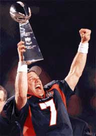
john elwayAnd for my last photo, I wanted to present what relief truly looks like. Denver Broncos Quarterback John Elway hoists his first Super Bowl trophy completing a 13-year odyssey that saw the legend guide the Broncos to lose three previous championship games 155 to 40 points.

That fact was seemingly jettisoned from Elway’s mind when the Vince Lombardi trophy when the Hall of Fame player received the prize from then Commissioner Paul Tagliabue in 1998.


Photo Credits:


Nighthawk and Summer Evening were taken from Lenin Imports.
John Elway photo taken from the Denver Broncos Team Web site.

Monday, January 15, 2007

Check. Check. Let's Start Typing....

two cranky old guys in the balcony

At some point, I will focus and write some blogs. But for now, I'll carve my own nitche on the World Wide Web with this class blog.

Oh, I love this quote from the punk-poetess Patti Smith: "In art and dream, may you proceed with abandon. In life, may you proceed with balance and stealth."